Choosing the Best Font and Font Size for Email Newsletters
Numerous studies have shown that email marketing is, by far, the most cost-effective of all digital marketing channels.
But that doesn’t mean all email marketing campaigns bring killer returns.
There are many nuances and important strategies that contribute to a successful email marketing campaign.
Choosing the best fonts for newsletters is one of them.
Some people assume that the choice of font is unimportant or that the best choice is to go with the defaults.
This is a mistake.
Marketers who want to make the most of their email campaigns cannot ignore formatting and choice of font.
They need to use it to their advantage.
Table of contents
Best Fonts For Newsletters (Choosing The Right Style)
Numerous studies have shown that email marketing is, by far, the most cost-effective of all digital marketing channels.
But that doesn’t mean all email marketing campaigns bring killer returns.
There are many nuances and important strategies that contribute to a successful email marketing campaign.
Choosing the best fonts for newsletters is one of them.
Some people assume that the choice of font is unimportant or that the best choice is to go with the defaults.
This is a mistake.
Marketers who want to make the most of their email campaigns cannot ignore formatting and choice of font.
They need to use it to their advantage.
Font and Human Psychology
Marketing, in many ways, is just applied social psychology.
Marketers use subtle cues to compel people to take a certain course of action, ideally with the target believing it was completely their decision to do so.
There are many different cues that marketers use to do this, such as specific colors, images, and words.
Studies have shown that the font, typeface, and formatting of text can affect people in the same way.
In one study, a researcher gave test subjects a paragraph of text to read and then asked two questions to gauge their feelings and opinions towards the information in the paragraph.
The researchers were quietly using different typefaces for different test subjects. The fonts tested were Baskerville, Computer Modern, Georgia, Helvetica, Comic Sans, and Trebuchet.
One might expect the results of the study would show little difference in emotional reactions based on font, especially as some of the fonts were similar.
However, this was not the case.
Those who viewed text in the Baskerville font were two percent more likely to be optimistic than those viewing it in other fonts.
With a sample size of over 45,000, that is statistically significant.
Two percent may not sound like much to most people, but to a marketer looking for an edge, it can’t be ignored.

In another study, two test groups were given different versions of the same document.
One was tastefully formatted, while the other was an intentionally poor example of font selection and formatting.
Subjects given the shoddily formatted document showed obvious signs of displeasure and negativity.
In marketing, it’s vital to consider consumer emotions. In general, marketers want to create a feeling of optimism in their messaging.
A decision to buy is based on trust, and trust and optimism go hand-in-hand.
Font Size and Reader Responsiveness
One of the biggest fears marketers have when writing marketing copy is that people simply won’t read it.
Fonts affect people’s emotions, and that, in turn, influences the decision to keep reading or not.
People who have positive thoughts and feelings tend to keep reading, while those who get bored, frustrated, or annoyed tend to stop.
Choice of typeface is just one of the factors that influence whether or not people keep reading. Another key factor is size.
It used to be that everyone swore by 10-point font for body text. Back then everything still revolved around printed media even as computers became commonplace.
10-point type is perfect for printed matter.
In the age of the Internet and mobile devices, the rules of font size have changed.
Most marketers and design professionals now agree that the minimum font size for body text in emails and blog posts is now 12-point
Many suggest 14-point or even 18-point font because the screens of desktop monitors tend to be farther from people’s faces than printed media they hold in their hands.
Also, people do not experience text on a mobile device the same way they do on a sheet of paper.
Larger font sizes are more comfortable for people to read.
This comfort correlates to positive emotions that make readers more willing to continue reading and to convert.
There is a limit to the advantages of larger font, though.
If you publish your body text in 36-point font, it will look like something thrown together by a child.
People will feel under attack from the text, and scrolling through it will seem laborious.
As a rule of thumb, keep all body text under 18 points and all header text under 36 points.
The Effect of Paragraph Breaks and Line Spacing on Attentiveness
The importance of font choice and sizing may seem straightforward enough, but line spacing also has a huge influence on people’s attentiveness.
People tend to scan emails instead of reading them straight through, and line breaks cause readers to pick up on the major points and read more carefully.
A wall of text tends to be offputting. Realizing the effect of line spacing on reader behaviors, marketers tend to use paragraph breaks more often than other writers.
There is another aspect of spacing that is important, though, and that is the actual text spacing between lines.
Depending on the email platform you’re using, leaving your line spacing at the default setting may mean you are writing with single-spaced lines.
The problem with single-spaced lines is that they have the same effect as massive blocks of text.
When readers see more than three single-spaced lines together, they tend to get annoyed and skip over them.
To keep this from happening, we recommend that you change your line spacing to 1.4 or 1.5 instead of 1.0.
This will give ample space for your sentences to breathe and allow people to digest your writing.
If you have a dark background with light text, consider increasing this to about 1.7.
Don’t get carried away with line spacing, though.
Some marketers appear to think more space is always a good thing, and that’s not the case.
If your line spacing is 2.0 or greater, your text will look disorganized and juvenile.
Such spacing dilutes visual continuity and makes it more difficult for readers to follow the progression of your ideas.
So What Is the One True Font?
We will give you the answer right away: there is no one true font or typeface.
That is why options exist.
Just as with colors, different fonts and typefaces appeal to different emotions.
The ones you pick need to appeal to the specific demographics that you are targeting.
With that in mind, here are some thoughts on common typefaces.
Times New Roman
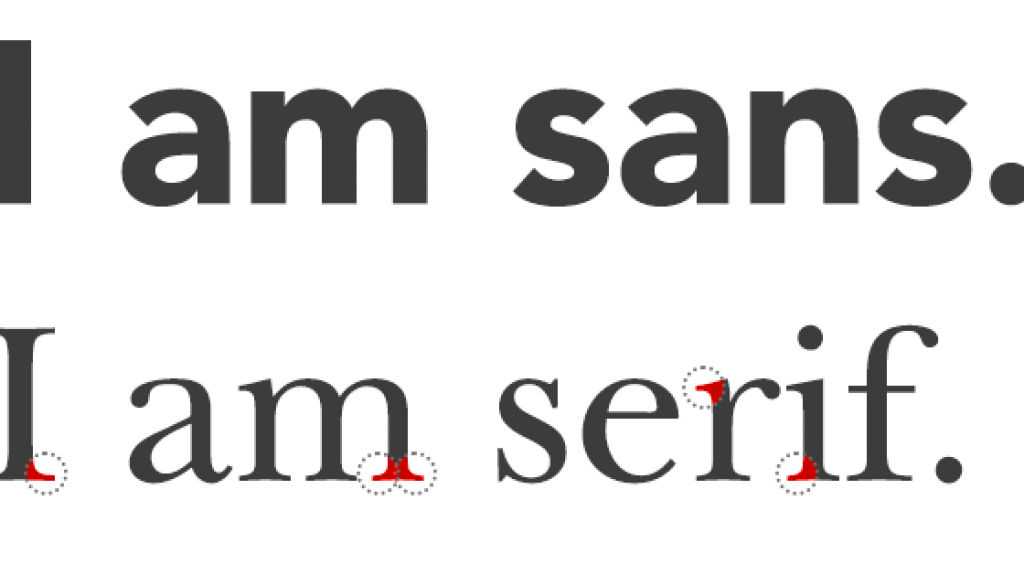
For a long time, Times New Roman was the most widely used serif typeface in the world.
A serif typeface is a typeface that has little wings on the corners of the letters:
 People are very familiar
People are very familiar with Times New Roman and thus tend to react neutrally to it.
Georgia
Georgia is a solid typeface that has become very popular among digital marketers.
Typedia describes Georgia as a typeface that “combines high legibility with character and charm.”
The intention in creating Georgia was to have a typeface that looks both elegant and friendly while rendering well on small or low-resolution screens.
It is very similar to Times New Roman, except that it has a larger and rounder feel to it.
Helvetica
Helvetica is a commonly used sans-serif (no little wings) typeface.
In many applications, Helvetica is the default typeface because of its plain, neutral, and unassuming look.
A disadvantage of Helvetica is that it’s hard for people to take in large chunks.
According to Designtaxi, this is “because of its uniformity and lack of consistent spacing.”
The letters are also more “scrunched together” than they are in other fonts such as Georgia.
Helvetica and similar sans-serif fonts are fine to use in title and header text, but using them in body text is not advisable.
Arial
Arial was created in 1982 to be deployed on IBM’s xerographic printers and was subsequently licensed by Microsoft for use as the Windows default font.
Arial was designed as a competitor to Helvetica, and perhaps due to its ubiquity, designers and marketers often describe it as Helvetica’s ugly cousin.
Arial essentially compounds the things people dislike about Helvetica.
Like Helvetica, Arial is fine to use in titles and headers, but it’s usually a bad idea to use Arial in your body text.
Courier
This serif typeface is monospaced, which means that each letter or punctuation mark occupies the same amount of horizontal space on the page.
Courier is not easy on the eyes compared to other popular typefaces. Its main benefit lies in the fact that, being monospaced, Courier is easy to align into neat horizontal columns.
While marketers don’t generally favor the Courier typeface, there may be niche markets in which it is a good fit.
If you are marketing specifically to writers, they may gravitate to this font because it resembles a document typed on a typewriter. This can convey a rustic and friendly aesthetic.
Verdana
Verdana is a sans-serif font that seeks to fix the perceived shortcomings of with Helvetica and Arial.
Verdana is more open and adds space between letters to give them a more even feel.
It also uses small nuances to ensure that “ambiguous” letters like b, d, p, and q are not mirror images of each other like they are with Arial and Helvetica.
This helps to improve readability and lessen reader fatigue.
The benefit of sans-serif typefaces is that they tend to convey a sense of playfulness and informality.
If that is what you are going for in your newsletter marketing, Verdana is probably your best option for body text.
Impact
As its name suggests, this typeface is intended to make an impact on the reader.
It does this with its compact spacing and inherently bold strokes.
Living up to its name, Impact is great for header and title text.
You may also want to use it in any marketing images you may have.
For body text, Impact is not a good choice. Its compact construction makes it difficult to read in blocks of text, especially when readers are viewing it on the small screens of mobile devices.
Tahoma
This widely used sans-serif font is perfect for marketers who need to write email newsletters in languages other than English.
Unlike other widely used Internet fonts such as Georgia and Verdana, it has a complete Unicode character set.
This means Tahoma is compatible with Asian and other non-Latin characters as well as Latin letters with accent markers.
One issue with Tahoma, though, is that it is not as widely as supported as other common Internet fonts such as Georgia and Verdana.
There may be compatibility issues, with certain characters displaying as gibberish.
Baskerville
Upon hearing of the merits Baskerville as noted in the studies above, some marketers will naturally want to use it.
However, as a less common typeface, it may render on some devices as another serif font such as Georgia or Times New Roman.
Comic Sans
As the name suggests, this widely used typeface initially became popular in comic books.
With its meandering strokes, Comic Sans takes the playful and informal feel of sans-serif typefaces to another level.
Both the design and corporate worlds revile the use of Comic Sans for anything remotely serious.
There is even a well-known design tome called Thou Shalt Not Use Comic Sans.
Comic Sans is perhaps appropriate if you are selling children’s products. If you are going for an adult and professional feel, however informal, you should use something else.
Mixing Typefaces
Recognizing the fact that different typefaces have their advantages and disadvantages, some marketers may consider using a mixture of them in their marketing emails.
However, this is not advisable. At most, you should use two typefaces: one for title and header text and another for body text.
One problem that arises when employing too many typefaces in marketing emails is that it aggravates readers.
The resulting appearance is cacophonous.
It’s painful for people to read— they want to get away from it as soon as possible.
The effect is similar when marketers create a rainbow of different colors in their text— also an ill-advised choice.
An additional problem that arises when using three or more different typefaces is that email service providers will likely flag the message as spam.
To check how spam filters will react to your typefaces and other aspects of your email, use DirectIQ‘s Spam Doctor feature.
Using Rare Typefaces
So you’ve found the perfect font.
Not so fast!
In many cases, it’s difficult to use your typeface of choice in your emails.
For example, in Gmail, you can only choose between Sans Serif (like Helvetica), Serif (like Times New Roman), Fixed Width (like Courier), Wide, Narrow, Comic Sans MS, Garamond, Georgia, Tahoma, Trebuchet MS, and Verdana.
If, however, you use Direct IQ for your email newsletters, you will have a wide selection of typefaces to choose from.
A/B Testing
If you are unsure about the best font to use for your target market, one thing that you can do is use your email marketing platform, such as DirectIQ, to implement an A/B test.
To implement an A/B test, create two versions of your newsletter in which everything is exactly the same except for the fonts.
Measure the responsiveness of your recipients based on the fonts you chose. You can use this information to make font decisions in the future.
Best Newsletter Font (Our Top Pick)
When it comes to picking the best newsletter font, Bebas Neue is a sans-serif font that is widely used in email marketing.
With its minimalist design, Bebas Neue conveys a feeling of professionalism and sophistication.
At the same time, its clean lines give it a modern look that will appeal to younger audiences.
If you are designing an email newsletter, be sure to take the following factors into consideration:
- The type of content you are including in your newsletter
- The tone that you want to set
- The age group of your target market
Bebas Neue is a versatile font that can be used for a wide range of newsletters.
If you want to add a bit of personality to your newsletters, you can always swing for the fences and use some experimental fonts.
With the right email marketing platform, you can split-test the use of different fonts – and see which performs better.
For instance, you could produce two versions of the same email newsletter – each with a different font.
You can then compare the conversion rates of the two newsletters and make a data-backed decision on which to use going forward.
While you might be drawn to using bright and flashy colors in your newsletters, remember that fonts are just as important in setting the tone of your message.
Best Fonts For Newsletters (Highly Recommended)
In general, the best fonts for newsletters are sans-serif fonts.
Sans-serif fonts are clean and simple, which makes them easy to read.
Some of the best fonts for newsletters include:
- Bebas Neue
- Helvetica
- Arial
- Verdana
If you’re like us, it’s nice to experiment with different fonts in your email newsletters.
The best font for newsletters really comes down to personal preference – along with any data you can collect on how recipients interact with your email content based on the fonts used.
Rather than trying to tweak many different variables at the same time to improve conversion rates, it’s better to focus on seemingly small things, such as fonts, to get a clear sense of what is working and what is not.
In Conclusion
As with so many elements of design and marketing, when it comes to choosing the right font for your email newsletters, the devil is in the details. To recap, here are some things to keep in mind:
- Choice of font, font size, and line spacing greatly impacts readability.
- Employ paragraph breaks liberally to avoid the dreaded wall of text.
- Choose a font appropriate for your target audience.
- Avoid using more than two fonts at a time.
- Be judicious in your use of color.
Best Fonts For Email Newsletters (7 FAQs)
What is a professional font for emails?
A professional font for emails will appear clean and polished. Arial, Calibri, and Verdana are just three examples of professional fonts that are used in emails. When it comes to picking a font for your emails, it’s important to consider the context and audience for the email content, as some fonts may be more appropriate for certain industries or purposes.
What is the most popular font for emails?
However, Calibri has become a popular choice in recent years, particularly for those who want to ensure their email content is easy to read and navigate through.
What is the most professional font size for email?
Based on my own personal preferences, the most professional font size for emails is around 10-12 points. This size is large enough to be easily readable, but not so large as to appear overwhelming for the reader in any way. It is also important to consider the font and layout of the email, as some fonts may be more legible in larger or smaller sizes.
What font looks most professional?
In the right context, any font can look presentable. It depends a lot on the format and layout of the email. Arial, Calibri, Verdana, and Times New Roman are all generally perceived as being professional and are used across different forms of content. When you are choosing between different fonts, you should always consider their readability and legibility.
What is the friendliest professional font?
As friendliness is subjective, it’s tough for us to determine what the “friendliest” professional font is for any given recipient. Although, with that being said, some fonts like Calibri, Arial, and Verdana are naturally “inviting” because they are easy on the eye. Using a font with a clean, modern appearance is the first step to engaging readers with your email content.
Is Calibri a professional font?
You have likely seen Calibri used across a full range of professional contexts, especially for business emails. This is a sans-serif font that is easy for recipients to read and has a clean, modern appearance. While Calibri is immensely popular, it’s not the only professional-looking font available to those who want to successfully engage potential or existing customers.
Is Calibri good for emails?
Yes, Calibri is a good choice for emails. This font is widely used in professional contexts, both in the B2B and B2C world. Ultimately, the best font for an email will depend on the specific needs and goals of the sender, along with the preferences of the audience.


