


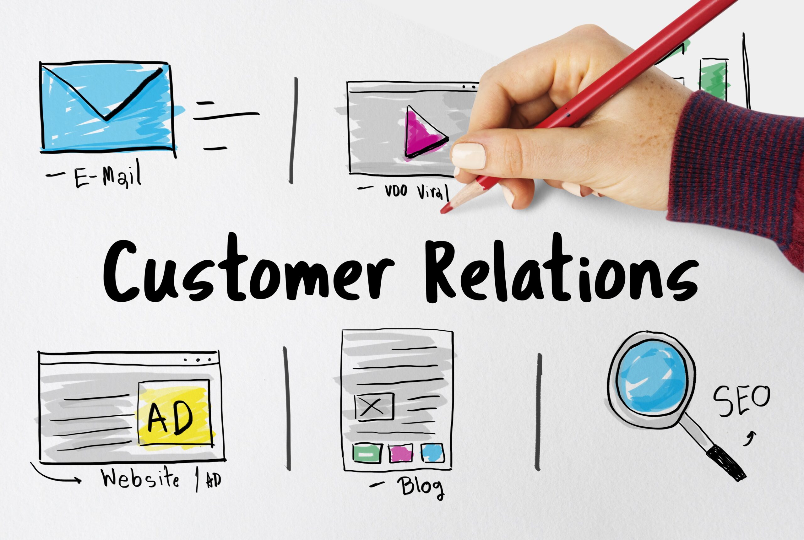
Responsive Email Template – DirectIQ’s Guide
Creating a responsive email newsletter template is essential for any email marketing campaign. It ensures that your emails look great on any device, regardless of the screen size, and can help to increase your conversions. In this guide, we will provide an overview of what responsive email design is and why it is important, as well as a detailed guide to creating a responsive email newsletter template. We will also provide tips on how to make sure your newsletter is responsive and how DirectIQ ensures email template responsiveness.
Introduction to Responsive Email Design
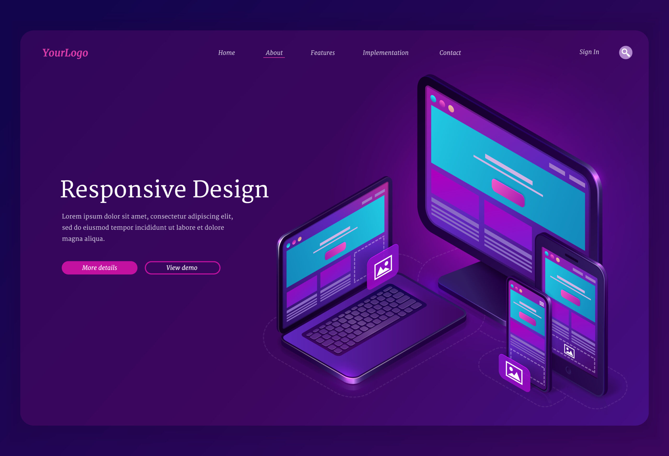
Responsive email design is a technique used to ensure that your emails look great on any device, regardless of the screen size. This is done by using HTML and CSS that are designed to adjust based on the device and screen size. Responsive design makes it easier for you to reach your customers, no matter what device they are using.
Responsive design is important because the majority of people now access their emails on mobile devices. By making sure your emails look great on all devices, you can ensure that your emails are seen and read by your customers. Responsive email design can also help increase your conversions, as it makes it easier for your customers to take action on your emails.
What is a Responsive Email Template?
A responsive email template is an email template that is designed to be responsive. This means that it will automatically adjust to fit any device and screen size. This can be done by using HTML and CSS that are designed to adjust based on the device and screen size.
Responsive email templates are important because they make it easier for your customers to view and interact with your emails. They also make it easier for you to create emails that look great on all devices, as you don’t have to worry about creating separate versions for different devices.
How to Design a Responsive Email Newsletter Template
Designing a responsive email newsletter template is not as difficult as it may seem. Here are some tips to get you started:
- Start by designing your template in a mobile-first approach. This means designing your template with mobile devices in mind first, and then scaling up for larger devices.
- Make sure your template is easy to read and navigate on a mobile device. This means that all the text should be easily readable and all the buttons should be easily clickable.
- Use a fluid grid system to help you create a template that is designed to adjust to different screen sizes. This means using a 12-column grid system that will allow your template to adjust automatically.
- Use media queries in your CSS to adjust your template for different devices. This means using different CSS code for different devices and screen sizes.
- Test your template on different devices to make sure it looks great on all of them.
Benefits of Using a Responsive Design Approach
Using a responsive email template has many benefits. Here are some of the benefits of using a responsive email template:
- Reach more customers. By making sure your emails look great on all devices, you can ensure that your emails are seen and read by more of your customers.
- Increase conversions. Responsive email design makes it easier for your customers to take action on your emails, which can help increase your conversions.
- Save time. Using a responsive email template eliminates the need to create separate versions for different devices, which can save you time and effort.
- Improve user experience. By making sure your emails look great on all devices, you can ensure that your customers have a great experience when viewing your emails.
Tips for Creating a Responsive Template
Creating a responsive email template can be a bit overwhelming at first. Here are some tips to help you get started:
- Start with a simple design. This means keeping your template simple and focusing on creating a design that looks great on all devices.
- Use a fluid grid system. This means using a grid system that is designed to adjust to different screen sizes.
- Make sure all text is readable. This means making sure all text is easily readable on all devices and screen sizes.
- Use media queries. This means using different CSS code for different devices and screen sizes.
- Test your template. This means testing your template on different devices to make sure it looks great on all of them.
Best Practices for Responsive Email Design
When creating a responsive email template, it is important to follow best practices. Here are some best practices to follow when creating a responsive email template:
- Keep it simple. This means keeping your template simple and focusing on creating a design that looks great on all devices.
- Make sure your content is readable. This means making sure all text is easily readable on all devices and screen sizes, and that all images are sized correctly.
- Use media queries. This means using different CSS code for different devices and screen sizes.
- Test your template. This means testing your template on different devices to make sure it looks great on all of them.
- Use a fluid grid system. This means using a grid system that is designed to adjust to different screen sizes.
How DirectIQ Ensures Email Template Responsiveness
At DirectIQ, we understand the importance of responsive email design and we have taken steps to ensure that our templates are responsive. We have implemented a mobile-first approach to our design process, which means that we design our templates with mobile devices in mind first, and then scale up for larger devices.
We also use a fluid grid system to ensure that our templates are designed to adjust to different screen sizes. We also use media queries in our CSS to ensure that our templates look great on all devices. Finally, we test our templates on different devices to make sure they look great on all of them.
Testing Your Responsive Email Template
Once you have created your responsive email template, it is important to test it to make sure it looks great on all devices. Here are some tips for testing your template:
- Test your template on different devices. This means testing your template on different devices and screen sizes to make sure it looks great on all of them.
- Test your template in different email clients. This means testing your template in different email clients such as Gmail, Outlook, and Apple Mail to make sure it looks great in all of them.
- Test your template in different browsers. This means testing your template in different browsers such as Chrome, Firefox, and Safari to make sure it looks great in all of them.
- Test your template with different email services. This means testing your template with different email services such as SendGrid, MailChimp, and Constant Contact to make sure it looks great in all of them.
How to Make Sure Your Newsletter is Responsive
Once you have created and tested your responsive email template, it is important to make sure that your newsletter is always responsive. Here are some tips to make sure your newsletter is always responsive:
- Keep your template up-to-date. This means making sure your template is up-to-date with the latest HTML and CSS standards.
- Test your template regularly. This means testing your template on different devices and in different email clients, browsers, and email services to make sure it looks great on all of them.
- Use a fluid grid system. This means using a grid system that is designed to adjust to different screen sizes.
- Use media queries. This means using different CSS code for different devices and screen sizes.
Conclusion
Creating a responsive email newsletter template is essential for any email marketing campaign. It ensures that your emails look great on any device, regardless of the screen size, and can help to increase your conversions. In this guide, we have provided an overview of what responsive email design is and why it is important, as well as a detailed guide to creating a responsive email newsletter template. We have also provided tips on how to make sure your newsletter is responsive and how DirectIQ ensures email template responsiveness.
By following the tips in this guide, you can create a responsive email newsletter template that looks great on all devices and helps to increase your conversions. So what are you waiting for? Get started now and create the perfectly responsive email newsletter template for your email marketing campaign!