


Enhancing Campaigns with Mobile-Optimized Email Templates
Attempting to read a broadsheet newspaper in a broom closet is a resemblance of the struggle one faces when attempting to view an email on their phone that does not fit the screen. You squint, pinch and zoom, but it’s like trying to read a broadsheet newspaper in a broom closet. That’s where mobile-optimized email marketing templates step into the spotlight.
You see, over 43% of emails are now opened on mobile devices. In fact, if you’re not designing for these smaller screens from get-go, then there’s a big chance your message is getting lost in translation. But don’t fret! We’re here to give practical insights into creating engaging mobile-friendly emails.
We’ll walk through best practices for design and content creation along with how A/B testing can improve open rates. Hang tight as we delve deeper into this transformative realm of digital communication!
Table Of Contents:
- The Significance of Mobile-Optimized Email Marketing Templates
- DirectIQ’s Extensive Library of Mobile-Optimized Templates
- Best Practices for Mobile Email Design
- The Role of A/B Testing in Mobile Email Campaigns
- Crafting Responsive Email Templates Suited to Mobile Devices
- The Impact of Mobile Optimization on Email Marketing Success
- Designing Engaging Mobile-Optimized Emails
- Overcoming Challenges in Mobile Email Marketing
- The Future of Mobile-Optimized Email Marketing
- Conclusion
- FAQs in Relation to Mobile-Optimized Email Marketing Templates

The Significance of Mobile-Optimized Email Marketing Templates
Mobile optimization in email marketing is no longer an option but a necessity. Why? Because 53% of emails are opened on mobile devices. It’s clear that the significance lies in catering to where your audience is most likely engaging with your content – their mobile phones.
As you spend time creating compelling subject lines and crafting engaging body copy, remember this: If the design isn’t optimized for small screens, all efforts may go unnoticed. Let’s dive deeper into why mobile-friendly email templates are vital for successful campaigns.
Capturing Attention Instantly
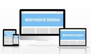
Emails need to make a strong impression within seconds or risk being sent straight to trash. Responsive emails do just that by adjusting their column layout based on screen size; whether viewed on desktop computers or smartphones, they maintain readability and visual appeal.
A responsive email template adapts its text size, image file sizes, and overall structure according to device type ensuring it feels tailor-made for every user experience. This boosts open rates significantly because let’s face it – nobody wants to pinch-and-zoom just to read an email.
Creating Seamless User Experiences Across Devices
Email users frequently switch between multiple devices throughout the day; from catching up on morning emails via smartphone over coffee, scanning through during lunch breaks at workstations, and finally wrapping up after dinner from tablets.
This makes using responsive designs critical as they ensure consistent viewing experiences across different platforms – leading not only to better user engagement but also higher click-through rates.
Beyond consistency though, there’s another key advantage: load times can be optimized for mobile devices. Shrinking image file sizes, prioritizing text content over graphics can ensure your emails load faster on smaller screens and don’t eat up precious data – a big plus in winning customer loyalty.
Optimizing Emails for the Future
With more and more folks checking their emails on mobile devices, it’s critical to make sure your messages are easy to read and engaging. But it’s no easy feat to get your email marketing strategy right.
Key Takeaway:
Mobile-optimized email marketing templates are crucial because a large portion of your audience is reading emails on their phones. These responsive designs not only look great on small screens but also boost open rates and engagement. They offer consistent viewing experiences across devices, fast load times, and preserve data usage – all key to winning customer loyalty.
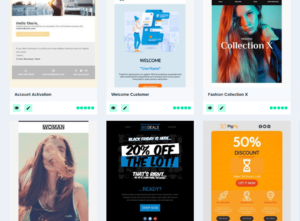
DirectIQ’s Extensive Library of Mobile-Optimized Templates
If you’re seeking a boost in your email marketing campaign, DirectIQ’s got you covered. With over 800 mobile-optimized templates to choose from, they’ve carved out a unique space in the email marketing platform.
What sets DirectIQ apart is its commitment to responsive design. These aren’t just any old templates; each one is crafted for optimal performance on mobile devices.
Pre-designed and Customizable: The Best of Both Worlds
The library consists not only of pre-designed but also customizable templates. So, whether you want something quick and ready or prefer personalizing it for branding purposes – there’s an option for everyone.
A customized template can add that touch of authenticity that resonates with customers more than generic designs ever could. Plus, having such extensive options allows you to keep refreshing your look without losing consistency in brand image.
Catering to Diverse Needs
No matter what industry or sector your business belongs to, chances are there’s an ideal template waiting for you within this vast collection at DirectIQ. You have access to diverse styles accommodating various content lengths and structures – be it newsletters or promotional emails.
This variety means no longer worrying about trying to force-fit content into ill-suited layouts or sacrificing visual appeal because the available options don’t quite align with your needs.
User-Friendly Design Interface
Moving beyond their impressive catalog size, let’s talk user experience (UX). For many people looking at hundreds of choices might seem overwhelming but fear not. Navigating through DirectIQ’s collection is a breeze thanks to their intuitive interface.
They’ve categorized templates in a way that helps you zero in on what you need without spending unnecessary time scrolling and searching. Efficient, isn’t it?
A Commitment to Responsiveness
Wrapping things up, what really sets this extensive library apart is its sharp focus on mobile optimization.
Key Takeaway:
Boost your email marketing campaign with DirectIQ’s over 800 mobile-optimized templates. They offer both pre-designed and customizable options to match any brand image or content structure. Navigate through this vast collection easily thanks to their intuitive design interface. And, the cherry on top? Each template is designed for optimal performance on mobile devices.

Best Practices for Mobile Email Design
Email marketing has shifted dramatically with the rise of mobile devices. It’s crucial to understand and implement best practices for mobile email design, ensuring your messages not only reach but resonate with your audience.
Focusing on Preheader Text
The preheader text acts as a secondary subject line, providing an additional opportunity to entice readers. This is especially important considering that 53% of emails are opened on mobile devices. So it’s critical to craft compelling preheader text to improve open rates.
To make sure your preheaders pop, keep them short and intriguing. Provide just enough information so users will want more – but remember they’ll likely be viewing this in portrait orientation where screen real estate is limited.
Designing for Different Views
In addition to crafting killer preheaders, it’s also essential that our email designs work well regardless if the user holds their device in landscape or portrait view. To do this effectively requires principles of responsive email design like using a single-column layout which automatically adjusts according to the available screen size.
Avoid overloading emails with excessive content or complex multi-column layouts – these can become unreadable when shrunk down on smaller screens. A simple rule of thumb? Keep it clean and concise. Remember: less often means more when designing effective mobile emails.
The goal here isn’t just readability; we’re aiming at maximizing user experience too. This means taking into account things like load times (which should always be quick.) and optimizing elements such as call-to-action buttons so they’re easy for thumbs-on-the-go.
Whether you’re working from scratch or using one of DirectIQ’s 800+ pre-designed mobile-optimized templates, these principles remain the same. Creating a user-friendly experience that encourages involvement is what mobile email design is all about – not just fitting everything into a smaller display.
So get started building those killer emails now – your open rates will thank you.
Key Takeaway:
Mobile email marketing is no longer a choice, but a necessity. With 43% of emails opened on mobile devices, your campaigns need to be designed for smaller screens. Focus on crafting compelling preheader text and designing responsive layouts that work in both landscape and portrait views. Remember: simplicity is key – avoid overloading content and complex designs. Instead, aim for clean, user-friendly design with clear call-to-actions that guide the reader effortlessly.

The Role of A/B Testing in Mobile Email Campaigns
A/B testing is a crucial part of any email marketing campaign, especially when it comes to optimizing for mobile devices. By carrying out an A/B test, it is possible to compare two distinct versions of the email and observe which one yields more desirable results with your target audience.
What Elements Should You Test?
From subject lines and preheader text to body copy and call-to-action buttons, there are several elements that can be tested in mobile email campaigns. But don’t try everything at once. Start by focusing on the components that directly impact open rates like subject lines or preheader text.
The idea here isn’t just about making emails look good on smaller screens; it’s also about ensuring they function effectively too. Think about aspects like load times, file size, and the convenience of user engagement with the material.
Improving Open Rates Through Testing
To improve open rates through testing, start building different versions of your emails where each version varies only slightly from the others – this could mean using different subject lines or changing up your preheader text.
You’ll want these variations sent out randomly among a small percentage of recipients before deciding which variant will go out to everyone else based on their performance. Remember: Results from desktop devices may not translate to mobile phones, as the screens and user behaviors vary significantly between them.
Analyzing Results from A/B Tests
Gathering data is key during A/B tests but understanding what those numbers tell you is even more important because insights derived from them guide future decisions.
Once you’ve run a few tests, look for trends. For example, do shorter subject lines get more opens on mobile devices? Does one call-to-action button color perform better than another?
If the results of your A/B testing indicate that certain elements are consistently performing well across various campaigns and demographics, it’s time to make those changes permanent in your email design template. This can help boost open rates and improve user experience.
A/B Testing: The Road to Better Mobile Email Campaigns
Comparing two versions of something to determine which performs better is the core concept behind A/B testing. This method can give you insights that lead to improved web designs and marketing strategies.
Key Takeaway:
Consider things like load times too. The idea is to experiment, analyze the results and then make changes based on what you learn. That way, you’re not just guessing – you’re making data-driven decisions that can really help improve your mobile email campaigns.
Crafting Responsive Email Templates Suited to Mobile Devices
As we navigate the digital age, it’s crucial to recognize that 43% of emails are opened on mobile devices. That’s nearly half your audience. So, when designing email templates for your marketing campaign, consider the different screen sizes and clients you’ll need to cater to. This is where media queries in responsive design come into play.
Research shows, Apple iPhone dominates as a top email client with a 38.9% market share. It underlines how vital it is for our designs not only be aesthetically pleasing but also adaptable across platforms – from desktop computers right down to small-screened mobile phones.
Fine-tuning Your Template Design
To create an effective template that provides a seamless user experience regardless of device size or type, focus first on its adaptability – particularly in terms of CSS media queries and compatibility with various clients.
CSS Media Queries let us apply styles based on certain conditions like viewport width or device orientation – making them indispensable tools for creating truly responsive email templates. Remember though; every pixel counts when dealing with smaller screens.
The Power Of Column Layouts And White Space
When thinking about layout structures for mobile-responsive emails, single-column layouts often work best due their simplicity and scalability across varying screen sizes.
White space can be equally influential in creating readable content while reducing cognitive load by giving elements room to breathe.
Aim For Lightweight Files To Boost Load Times
Email file size matters too – especially considering many users may open their emails using cellular data. Keeping your email content short and image file sizes small will help improve load times, creating a smoother experience for the reader.
Remember The Human Touch
Even as we embrace technology’s advancements, it’s essential to remember that at the end of each email is a human being. Tailoring subject lines to resonate with mobile users can significantly increase open rates. But don’t just stop there, always make sure your message strikes a chord with your audience for best results.
Key Takeaway:
Recognize that almost half of your emails are opened on mobile devices, so design templates to suit various screen sizes. Prioritize adaptability and compatibility using CSS media queries. Use single-column layouts for simplicity and leverage white space for readability. Keep email files light to boost load times, but remember the human touch – personalize subject lines and content to resonate with users.

The Impact of Mobile Optimization on Email Marketing Success
As we’re increasingly attached to our phones, it’s no shock that the effect of mobile optimization on email marketing has become more and more significant. According to Litmus, Apple iPhone alone accounts for a whopping 57.66% market share as an email client.
Mobile Optimization and Open Rates
Emails optimized for mobile are key players in boosting open rates. With users constantly checking their emails on-the-go, ensuring your design fits all screen sizes can drastically increase your chances of being seen.
When subject lines are easy-to-read and content loads quickly, you’ve got a winning combination for increased open rates – an essential metric in any successful campaign.
Influence on Click-Through Rates (CTR)
Beyond just opening the email, how much engagement does it drive? Here’s where click-through rates come into play. Well-designed emails not only catch attention but also make navigation easier leading to higher CTRs.
This means optimizing elements like button size and placement – they need to be large enough for touch screens yet not overwhelming or disruptive to the overall layout.
Riding High On ROI Wave
Ultimately, ROI should not be overlooked. Remember this – every second saved from quick load times equates directly with dollars earned. So investing time in creating responsive designs pays off substantially when viewed through the lens of ROI.
Note:To illustrate better, let’s say your regular desktop-oriented campaigns have an average conversion rate at 5%. But once you start using responsive templates tailored towards smaller screens & faster load times, imagine seeing that conversion rate skyrocket to 10% or more. Now, wouldn’t you agree it’s worth the effort?
Just keep in mind, DirectIQ offers a vast collection of mobile-optimized templates to simplify your tasks. With customizable designs suited for all screen sizes and devices, DirectIQ makes sure your email marketing campaigns resonate every time they’re opened.
Key Takeaway:
Mobile optimization is transforming email marketing. With a huge share of emails opened on mobile devices, tailoring your content for small screens can significantly boost open and click-through rates. Plus, faster load times mean better ROI – every second saved equals more dollars earned. And with tools like DirectIQ’s customizable templates, creating responsive designs that consistently hit the mark has never been easier or more effective.
Email service providers (ESPs) play a crucial role in mobile marketing. They offer features like responsive email templates, drag-and-drop editors, and A/B testing tools to help you create and optimize your campaigns.
When choosing an ESP, make sure they provide mobile-optimized templates that are easy to customize. Look for features like previewing emails on different devices and email clients, as well as the ability to track and analyze mobile engagement metrics.
With the right ESP and mobile-optimized email templates, you can elevate your email marketing campaigns and reach your audience effectively on any device.
Future Trends in Mobile-Optimized Email Marketing
As technology continues to evolve, so does mobile marketing. Here are some future trends to keep an eye on:
- Interactive emails: Adding interactive elements like buttons, forms, and carousels can enhance user engagement and drive conversions.
- Dark mode optimization: With the increasing popularity of dark mode, optimizing your emails to display properly in both light and dark modes can improve the user experience.
- Artificial intelligence (AI): AI-powered email personalization and automation can help deliver more relevant and targeted content to mobile users.
- Creating emails with a focus on mobile devices is essential to guarantee they provide an effortless experience for users.
By keeping up with the latest trends and utilizing mobile-friendly email templates, you can stay ahead of the competition and maximize your email marketing success.

Designing Engaging Mobile-Optimized Emails
The success of your email marketing campaign can hinge on how well you’ve optimized for mobile devices. This is because a significant chunk, since more than half of emails are opened on mobile devices.
Let’s start building our understanding by focusing on creating visually appealing and interactive emails. To make sure our emails are effective, we should think about load times, screen size and the user experience on various devices.
Focusing On Load Times And Screen Size
Remember that most people check their email while they’re out and about using their mobile phones. That means both file size and design have got to be right-sized for small screens with potentially slower connections. Smaller image file sizes help keep load times down so your audience isn’t left waiting around staring at a blank screen instead of engaging with your content.
To ensure an optimal viewing experience regardless of device or orientation (portrait or landscape), responsive design techniques should be employed in crafting the layout – from single-column layouts that stack elements vertically to utilizing CSS media queries which adapt presentation based on device characteristics such as screen resolution.
Crafting The Perfect Preheader Text And Subject Lines
Email open rates often come down to two things: subject lines and preheader text – these form the first impression before someone even opens your email. Making sure they’re concise yet enticing enough will pique curiosity leading more people into opening them especially when viewed through smaller screens common in many smartphones today.
Your goal here is simple: get recipients intrigued enough by what you say outside the body copy itself that they’re compelled to open the email. And then make sure that what you’ve promised in your subject line and preheader text is actually delivered within.
Ensuring A Smooth User Experience
When designing emails for mobile, it’s important to remember these tips: avoid heavy design elements, keep content concise and engaging, and make good use of white space. All these strategies help create a superior user experience on mobile devices.
Key Takeaway:
Don’t forget: Keeping your content short and sweet, using less heavy design elements, and smartly using white space can make reading on small screens a breeze. Crafting emails that are easy to digest on mobile devices not only improves the user experience but also boosts your email marketing campaign’s success.

Overcoming Challenges in Mobile Email Marketing
Email marketing on mobile devices is a difficult task to accomplish. Rendering issues, adapting strategies for a mobile-centric audience, and optimizing emails to load quickly are just some of the challenges we face. But with every challenge comes an opportunity for growth.
Tackling Rendering Issues Head-On
We’ve all been there: you spend time crafting what feels like the perfect email only to find out it looks completely distorted on your smartphone screen. That’s because different email clients render HTML differently, affecting how your email design appears across various platforms.
The key is to create responsive emails that adapt seamlessly regardless of screen size or device used. To do this effectively, one strategy is using CSS media queries which allows you to apply specific styles depending on the recipient’s screen size – making your marketing emails more adaptable and user-friendly.
Adapting Strategies for A Mobile-Centric Audience
Let’s not forget about subject lines. The real estate available differs from desktop computers to mobile phones, so adjusting them becomes crucial when targeting a largely mobile audience. A whopping 53% of emails are opened on mobile devices.
Your subject lines need to be compelling yet concise enough for smaller screens while still conveying the message efficiently. Another handy trick? Utilize preheader text as it provides additional context without cluttering up your subject line – offering potential boosts in open rates.
Faster Load Times Equals Happier Subscribers
No one likes waiting around forever for images or content short videos within an email newsletter loading slowly due to its file size. In the world of mobile email design, less is often more. Keep your content short and sweet while ensuring images are optimized for speed.
Consider also that media-rich emails can be a data drain on users’ mobile plans. An Email on Acid study showed reducing file sizes not only improves load times but could make your subscribers happier too.
Key Takeaway:
Mastering mobile email marketing can be a challenge, but it’s doable with the right strategies. Focus on creating responsive emails that render well across devices, crafting catchy yet concise subject lines for mobile audiences and ensuring your content loads quickly to keep subscribers happy. It’s all about being adaptable and user-friendly.

The Future of Mobile-Optimized Email Marketing
As we stand at the threshold of a new epoch in digital communication, having mobile-optimized email marketing layouts is no longer just an option but rather a must. AI tech’s influence on email marketing is a topic worth investigating, especially with its growing presence in our lives.
Emails now need to be more than just responsive; they have to feel personalized and interactive for each user. This includes taking into account how emails load images on different devices and considering factors like file size which affect load times.
Emerging Trends: The Shift towards Mobile-centric Design
The use of smartphones has significantly increased over recent years. As such, marketers must make sure their designs are adapted for smaller screens without compromising content quality or losing out key details due to shrinking images.
This calls for thoughtful design choices like single-column layouts which offer better readability while keeping your body copy short yet meaningful. Emails should also prioritize important information at the top so users don’t have to scroll too much.
Predictions: Where Are We Headed?
Mobile-responsive templates will continue playing an integral role in future strategies with improvements aimed at enhancing user experience across various screen sizes from desktop computers down to mobile phones.
We’re likely going see innovations centered around simplifying CSS media queries – making them easier for developers while ensuring compatibility across multiple email clients – thus reducing rendering issues that sometimes plague emails viewed on mobile devices.
The Role Of AI In Email Campaigns
Artificial Intelligence is also making its mark in the realm of email marketing. With capabilities to analyze user behavior, it can help create responsive emails that feel personal and relevant for each recipient.
This could be anything from automated A/B testing of subject lines on mobile devices to analyzing open rates and optimizing send times based on when users are most likely to engage with their inbox.
Key Takeaway:
Future trends suggest that the importance of mobile-friendly email marketing will only grow. It’s critical to prioritize clear, concise content and engaging visuals for small screens. Remember, effective emails aren’t just about delivering information; they’re about creating an interactive experience for your audience.
Conclusion
Mastering mobile-optimized email marketing templates is a game-changer. They let you engage with over 43% of your audience who open emails on their phones. Your content shines in any screen size, creating an inviting user experience.
Best practices guide the way to success. The preheader text can reel readers in, and a single-column layout keeps them scrolling. A/B testing gives vital feedback to refine and perfect your approach.
Dive into DirectIQ’s treasure trove of customizable templates for quick starts or explore free resources online for unique designs. Tackle common challenges head-on and stay ahead with emerging trends.
Your takeaways? Mobile-friendly emails aren’t just nice-to-haves; they’re must-haves in today’s digital world!
Are you ready to “mobilize” your Email Marketing ? Sign up to DirectIQ for free today!
FAQs in Relation to Mobile-Optimized Email Marketing Templates
How do I optimize email marketing for mobile?
To make your emails mobile-friendly, use responsive design. Keep subject lines short, and use a single-column layout that works best. Always preview your emails before sending.
Do email templates work better on mobile?
Yes, but they need to be optimized. Mobile-optimized templates adapt to smaller screens, making content easier to read and interact with.
How do I make an email template mobile friendly?
Create a responsive layout that adapts to different screen sizes. Prioritize key information at the top and ensure buttons are large enough for tapping.
What is mobile optimized email?
A mobile-optimized email is designed specifically for readability and functionality on smartphones or tablets. It ensures the best user experience regardless of the device used.